About 20% of the world’s population is neurodiverse – and I’m one of those people. When I come across Salesforce pages and forms that are dense with fields and lack an easy-to-follow structure, it hurts my brain. And then the UX designer in me snaps to attention, listing all the ways to make the user experience better and more accessible – for everyone.
So let’s talk about what it means to design for neurodiversity and five best practices for using Salesforce Lightning Design System (SLDS) to improve the experience.
Here’s what we’ll cover:
What does it mean to design for neurodiversity?
Focus on cognition
Five best practices for using SLDS to design for neurodiversity
Don’t make users think too hard
What does it mean to design for neurodiversity?
How neurodivergence shows up varies by individual. For example, I have severe ADHD, which means I – and others like me – get easily distracted, have issues with short-term memory, process information more slowly, and rely heavily on predictability.
Even among folks who have ADHD, there’s a range of experiences. Extend that variability across any number of needs and it quickly becomes apparent how important it is for all of us to support neurodiversity.
So, let’s use this continuing education portal page as an example. How do we take a messy experience and turn it into something that’s:
- easier on the brain,
- is more clearly structured,
- and doesn’t make users think nearly as much?
Using SLDS is a key piece of the answer to this question about accessibility. But we need to talk briefly about the categories of web accessibility guidelines and why I like to draw attention to cognition. Back to top
Focus on cognition
There are federal, state, and local compliance rules for ensuring digital experiences are accessible. The Web Content Accessibility Guidelines (WCAG) provides standards for meeting those requirements. Within those guidelines, success criteria fall into four categories: perceivable, operable, understandable, and robust (POUR).
Because those categories aren’t intuitive to me, I like to describe the success criteria in a way that reflects who is affected by our designs. My categories are: sight, cognition, hearing, interaction, and technology (SCHIT).
I focus on cognition because it’s often overlooked and affects a range of neurodivergent folks, such as those who experience dyslexia, ADHD, and autism.
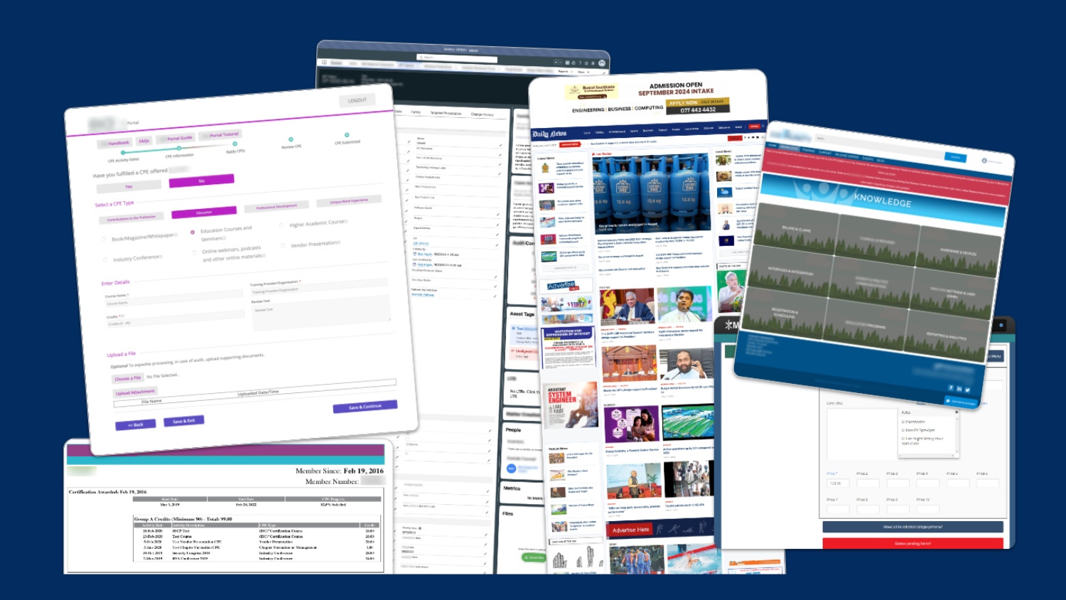
This sampling of web pages and forms show just how overwhelming the designs can get if we don’t consider accessibility and usability. Back to top

Five best practices for using SLDS to design for neurodiversity
What if we could take that turn an overwhelming experience and turn it into something so intuitive, so user-friendly, that it’s like Salesforce is reading our minds? Whether you’re designing for focus, clarity, or just keeping things easy to navigate, these tips will make a world of difference.
Let’s dive into five ways we can design with the SLDS to do just that – and support neurodiverse users along the way:
1. Insist on consistency
It matters how you use brand colors, fonts, voice and tone, field labels, icons, flows, and more. Make sure to establish rules and adhere to them. This helps you maintain consistency. The beauty of a design system like SLDS is that it bakes in many of these considerations so you can apply them easily.
2. Embrace predictable organization
Predictability isn’t boring. Knowing what to expect builds familiarity and, ultimately, helps you get your work done faster. Three specific areas to address, include:
- Visual hierarchy. Make sure there’s only one main (h1) heading on each page and that subsequent heading sizes cascade from there (h2, h3, and so on). Ask what is most essential to include in the main navigation; not everything should be included at that top level. If you have text that isn’t the title, make use of the size variables that SLDS offers you and make sure you’re not messing with reading order.
- Visual cues. People are accustomed to familiar visual cues and patterns. For example, they understand that checkboxes tend to be square, radio buttons are round, and flows start from top to bottom. Don’t mess with that expectation. Also remember: field length should roughly match the length of the expected input; underline links; make error and empty states clear, using specific wording.
- Chunking information. If there is a lot of necessary information, consider grouping related items in sections. And, make the distinction between sections clear.
3. Streamline: Less is more
Clutter is the enemy of focus. Just because you have many component options doesn’t mean you have to use all of them. When it comes to notifications, for example, you don’t need multiple alert banners AND modals to pop up.
Neurodivergents also need to know exactly where they need to start and where to go next. Progressive disclosure is essential. It allows you to display only the input fields that are needed in the moment and progressively trigger subsequent fields. This helps you to guide the user through the process, a step at a time, and keep them focused.
4. Serve guidance at the right time
Using tooltips and popovers is a common way to provide help or context to users. Be clear and concise with the information you share. Provide just enough context or support text. No one needs a novel. Also, make sure the tooltip or popover doesn’t take over the whole screen and prevent the user from interacting with the field.
5. Remember mobile
Make sure you know how components are going to flow when viewed on a phone. For example, tabs become an accordion on mobile devices. That changes how a user needs to interact with the component and may introduce confusion. Check SLDS documentation to learn how components will render in mobile views.
In this example, using a picklist instead of tabs more clearly shows what the next step needs to be. Back to top

Don’t make users think too hard
While it’s imperative to consider accessibility needs when designing any type of digital experience, the benefits extend to everyone. Don’t make people think too hard. A few best practices around organization and consistency will help you design your Salesforce org to be clear and easy to use. Back to top


