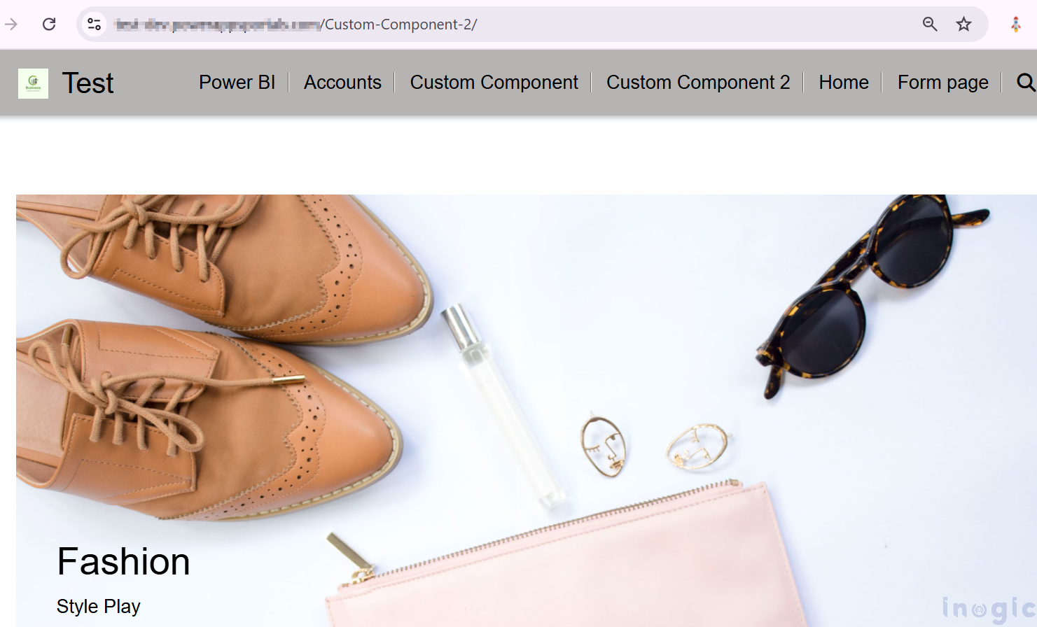
During a recent project, a client wanted a consistent banner design across multiple pages in Power Pages Design Studio, with customizable text displayed over the banner and it was a repeated task for the client. Also, the client had basic knowledge of the Power Pages Design Studio but they were not familiar with Power Pages Management which is linked with coding.
To overcome this scenario, we have created a custom component for the client, and now the client is using the same custom component in the designer studio for multiple pages with different values/data.
Step-by-Step Guide: To create a Custom Component in Power Pages Portal
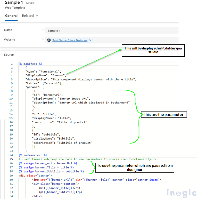
First, we have to create a Web Template in which you can allow a maker to pass parameters, you need to add a {% manifest %} tag to the web template.
The manifest is a JSON object that defines the properties of the web template displayed in the design studio. The parameters relate to variables that developers use in their source code, and low-code makers can configure their values.
Here’s a breakdown of the key properties used when configuring the {% manifest %} tag in a Web Template for a Custom Component:
Manifest Properties
type
By setting the type to ‘Functional’, you enable the web template component to be added via the “Add component” process in Design Studio.
displayName
A friendly name for the web template component
description
A brief explanation of the web template component
tables
This specifies which Dataverse tables the web template can interact with. The logical names of the tables must be listed to ensure correct linking and data flow.
params
Set of parameters with specific properties that define their usage.
Properties of params:
id: This should match the variable used in the web template code and the Liquid include tag.
displayName: The user-friendly name that appears in Design Studio, allowing makers to recognize the parameter easily.
description: A short tooltip-like text providing context to makers on what the parameter does or how it should be used.
We created a Banner Component that accepts the URL of the banner Image, Title, and Subtitle as a parameter in the custom component with the below source code.
{% manifest %}
{
“type”: “Functional”,
“displayName”: “Banner”,
“description”: “This component displays banner with there title”,
“tables”: [“account”],
“params”: [
{
“id”: “bannerUrl”,
“displayName”: “Banner Image URL”,
“description”: “Banner url which displayed in background”
},
{
“id”: “title”,
“displayName”: “Title”,
“description”: “Title of product”
},
{
“id”: “subtitle”,
“displayName”: “Subtitle”,
“description”: “Subtitle of product”
}]
}
{% endmanifest %}
<!–additional web template code to use parameters to specialized functionality–>
{% assign banner_url = bannerUrl %}
{% assign banner_Title = title %}
{% assign banner_Subtitle = subtitle %}
<div class=”banner”>
<img src=”https://www.inogic.com/blog/2024/12/add-a-custom-component-preview-in-the-power-pages-portal/{{banner_url}}” alt=”{{banner_Title}} Banner” class=”banner-image”>
<div class=”banner-content”>
<h1>{{banner_Title}}</h1>
<p>{{banner_Subtitle}}</p>
</div>
</div>
Once the Web Template with the {% manifest %} tag is created, it will automatically appear in the Power Pages Design Studio.
To use the custom component please follow the below steps:
Open the Power Pages Design Studio and navigate to the web page where you want to add the component
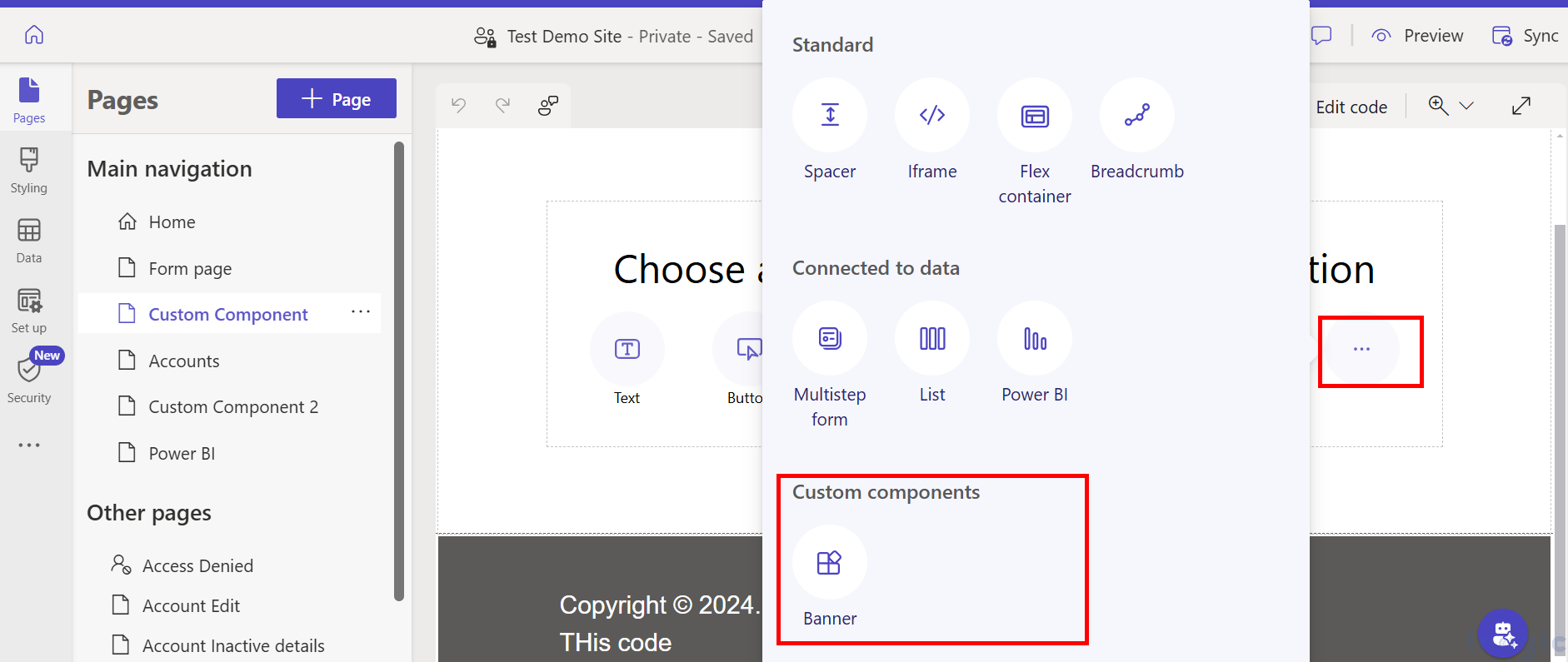
Then click on the three dots (More options) at the bottom of the page editor à All available custom components will appear, listed with the name you provided in the manifest tag (e.g., “Banner”).
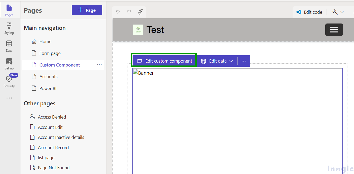
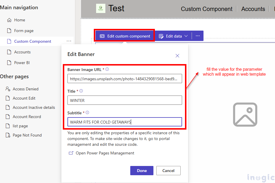
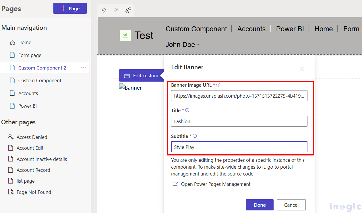
Once the custom component is added now click on the Edit Custom Component tab it will open a popup where we can provide values for the parameters declared in the manifest tag.
In our scenario, we have passed values to the parameters which are Banner Image URL, Title, and Subtitle.
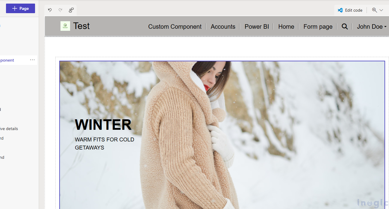
After passing the values to the parameters it will dynamically render the component on the page.
In our scenario, it looks like below:
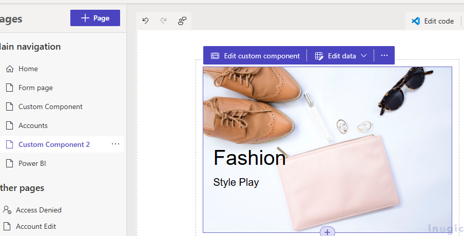
To showcase the reusability of the Custom Banner Component, we added another page and used the same component while passing a different Banner Image URL, Title, and Subtitle value highlighting its flexibility and ease of use across multiple pages.
Result in the designer studio
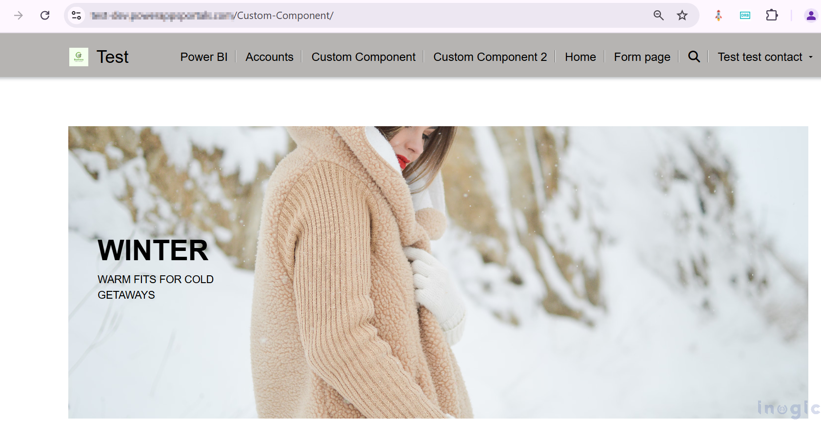
Final output on the preview website
Conclusion:
With the custom component, you can easily create multiple components tailored to your specific business requirements, offering flexibility and scalability for your website design

