Power BI Desktop empowers users to craft visually compelling dashboards and reports adaptable for both desktop and mobile interfaces. Its intuitive interface facilitates seamless transitions between designing for desktop and mobile platforms, guaranteeing optimal viewing experiences across various devices.
A standout feature of Power BI Desktop is its mobile layout view, which enables users to fine-tune their reports and dashboards specifically for mobile devices. This ensures that visualizations remain crisp, responsive, and user-friendly when accessed on smartphones or tablets.
Within the mobile layout view, users can leverage a suite of tools to customize their content for mobile consumption. This includes resizing visuals, optimizing spacing and alignment for smaller screens, and prioritizing key information for mobile users. By harnessing these tools effectively, users can create immersive and intuitive mobile experiences that effectively communicate insights and data to users on the move.
In this blog post, we will undertake a comprehensive exploration of this feature, delving into its intricacies through a meticulously structured step-by-step process.
Steps to open the Mobile view within Power BI Desktop:
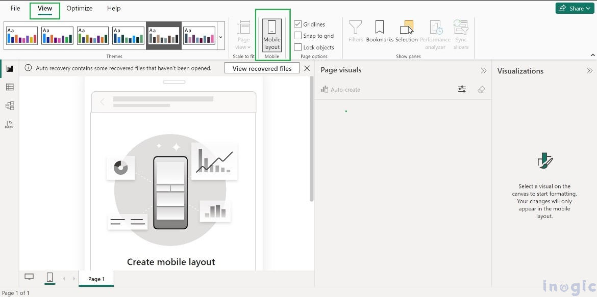
Here are two ways to open the mobile view,
From the taskbar, as shown in the below screenshot2. From the ‘View’ option located on the Ribbon bar
Additionally, users can seamlessly transition back to the desktop view by simply clicking on the desktop icon located at the bottom of the interface.
Use case Scenario:
Let’s consider a scenario for a better understanding the mobile view.
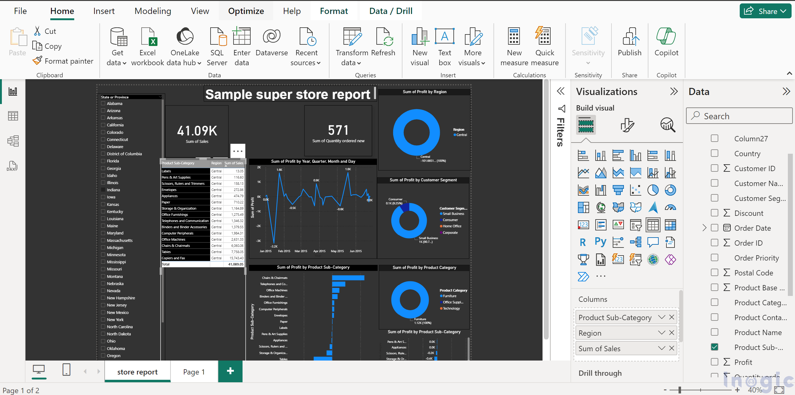
Here is an example of the browser view, and we will convert it into the mobile view.
To switch the current browser view to a mobile-friendly layout, simply follow these steps:
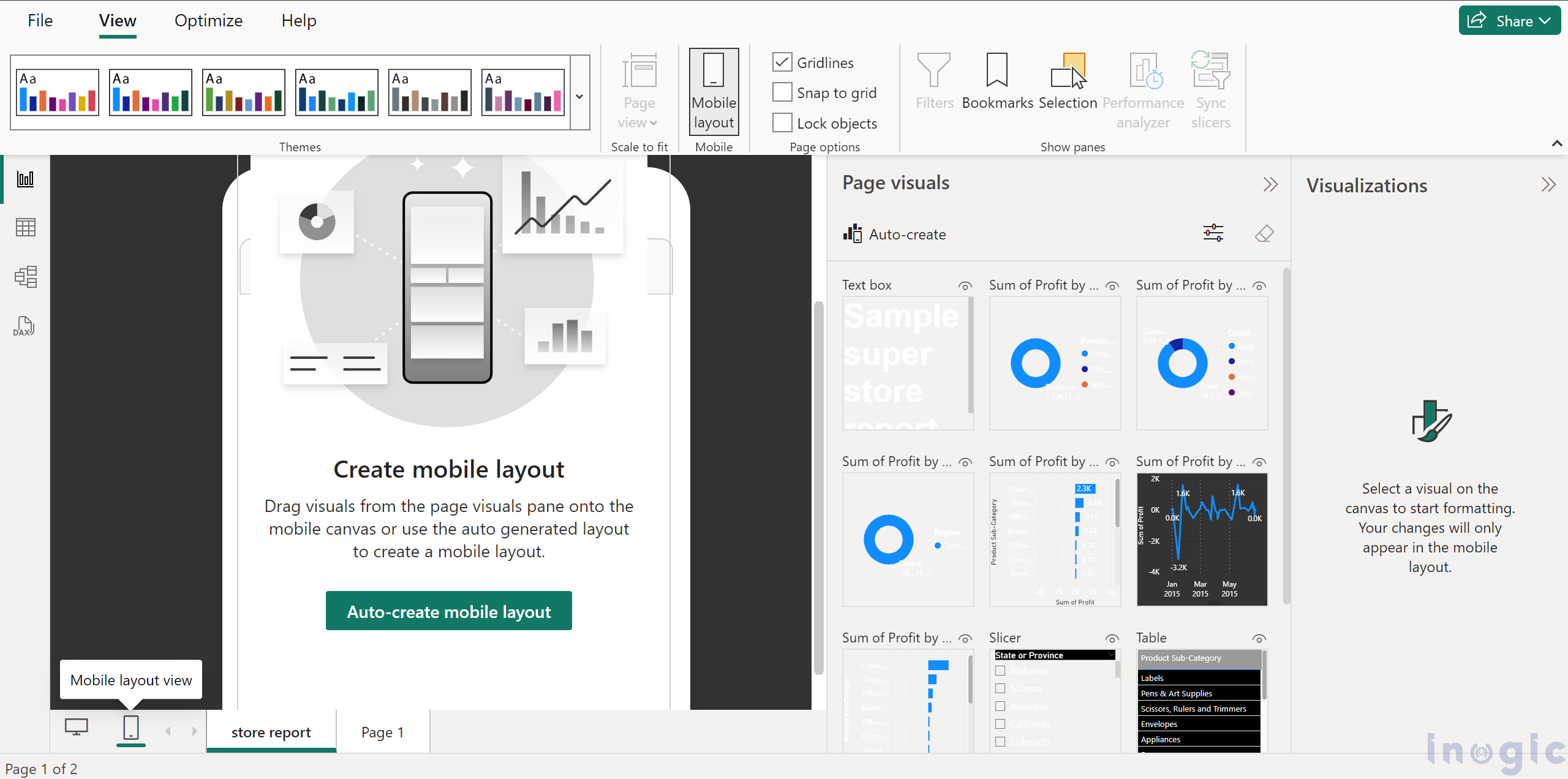
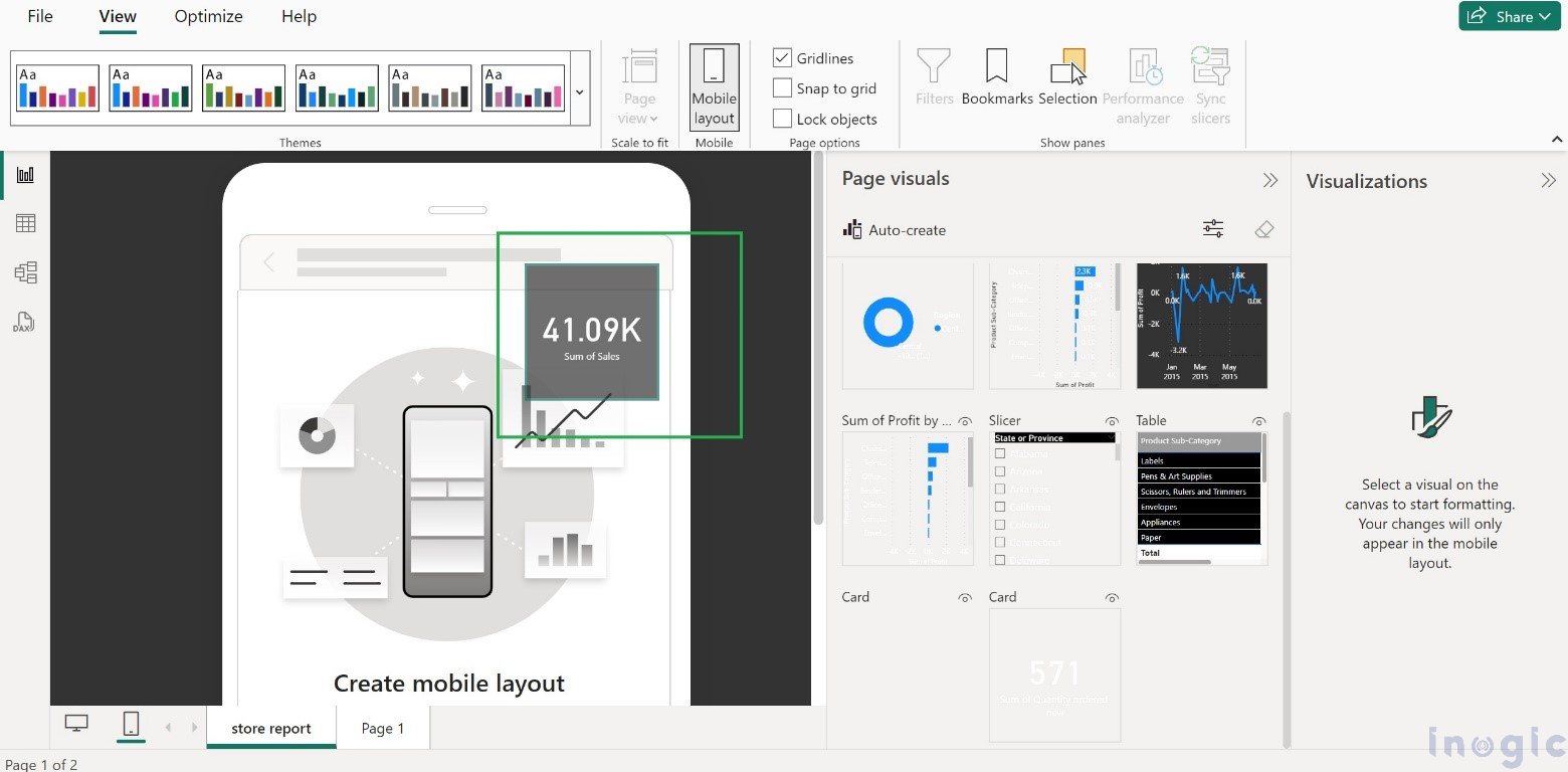
Step 1: Click on the Mobile Icon in order to switch to the Mobile layout.
The screenshot below illustrates the same.
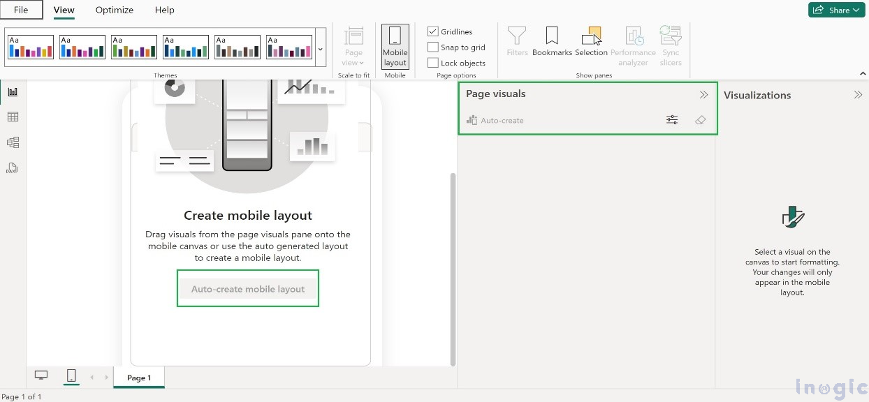
Step 2: It will be presented with two alternatives, as listed below:
Auto Create
Design Manually
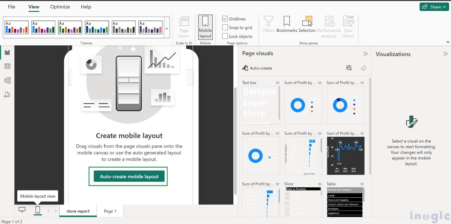
Opting for “Auto Create” entails Power BI Desktop automatically generating a mobile-friendly version of your report, simplifying the process for you.
So, a single click on the Auto-Create Mobile Layout option will design the visuals on the mobile layout view, as shown in the below screenshot.
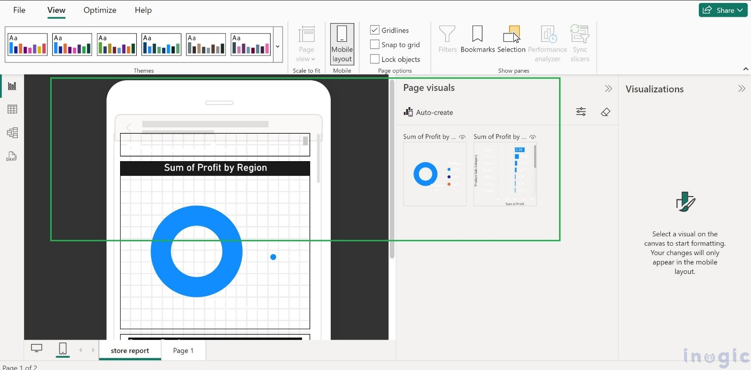
If you prefer to do it yourself as manual customization, simply drag and drop the tiles from the page visuals to craft your desired mobile layout.
Page Visuals
This feature lets us set up the mobile version of a report by adding visuals to it. It is visible in the page visuals on the right-hand side, as shown in the screenshot below:
Conclusion:
The enhancement improves the user experience by allowing Power BI to simplify the design process with its one-click auto creation of mobile views. This feature saves time and ensures a smooth user experience across various devices.

