Introduction:
Managing your customer’s organizations by using organization charts can help you visualize their hierarchy and the relationships between their departments and roles. As a result, you can tailor your sales approach to fit your customer’s needs and preferences, resulting in more successful sales. You can easily and precisely build an organization chart with Dynamics 365 sales by dragging and dropping which was not possible in an existing organization chart. It also helps contacts to keep up to date. An organization chart is available for account and contact.
To enable a smart organization chart, follow the below steps:
Go to the Sales Hub app > Navigate to the App setting area > Click on Org chart from the general setting sub-area.
Enable the toggle button to yes as shown in the screenshot below:
Step by Step guidance on how to use the organization chart
For this example, we are taking Account as our target entity to showcase the functionality of the organization chart feature. Follow the steps mentioned below to create the Organization chart
Steps: –
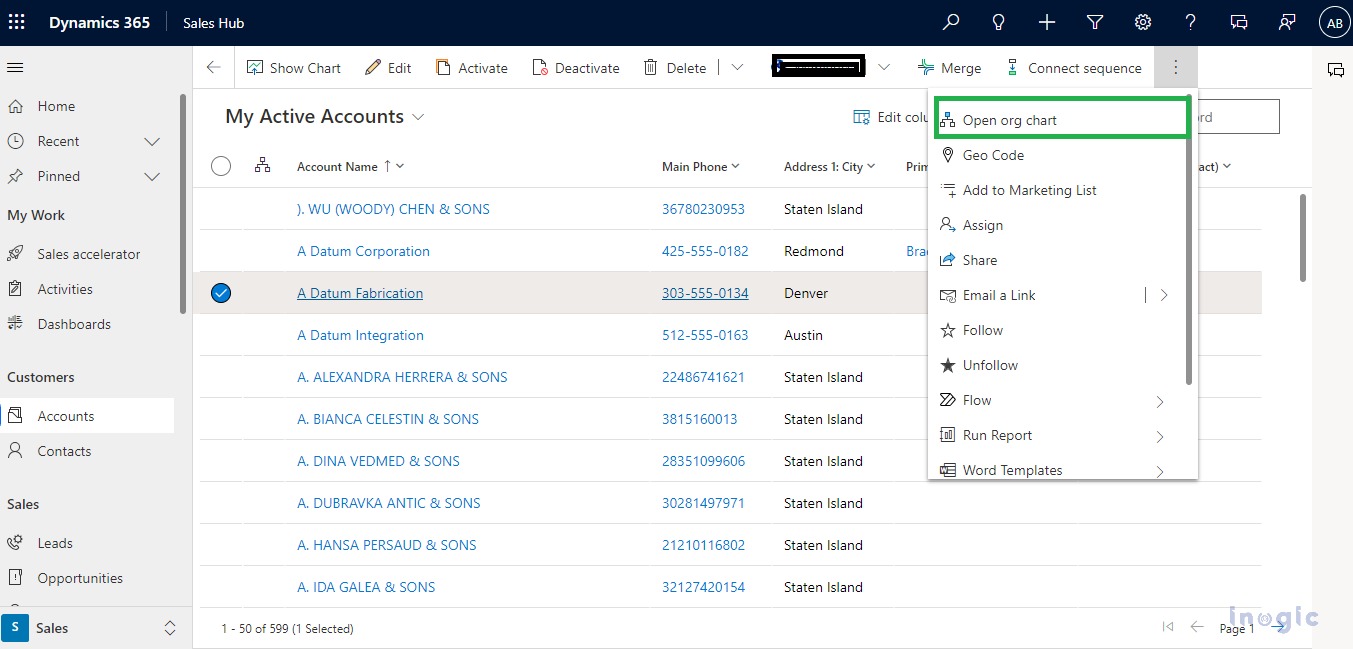
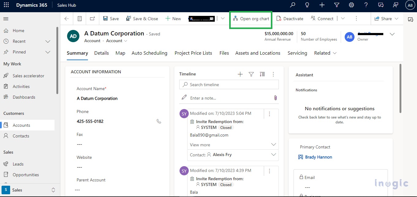
Open the Dynamics 365 Sales app > Select an Account record and click on ellipses> Open org chart will be shown click on that to open or Open a specific Account record > Once you open the Account click on Open org chart on the Ribbon Bar as shown in the screenshots below:
Note: For multiple selections of records this button will not be visible.
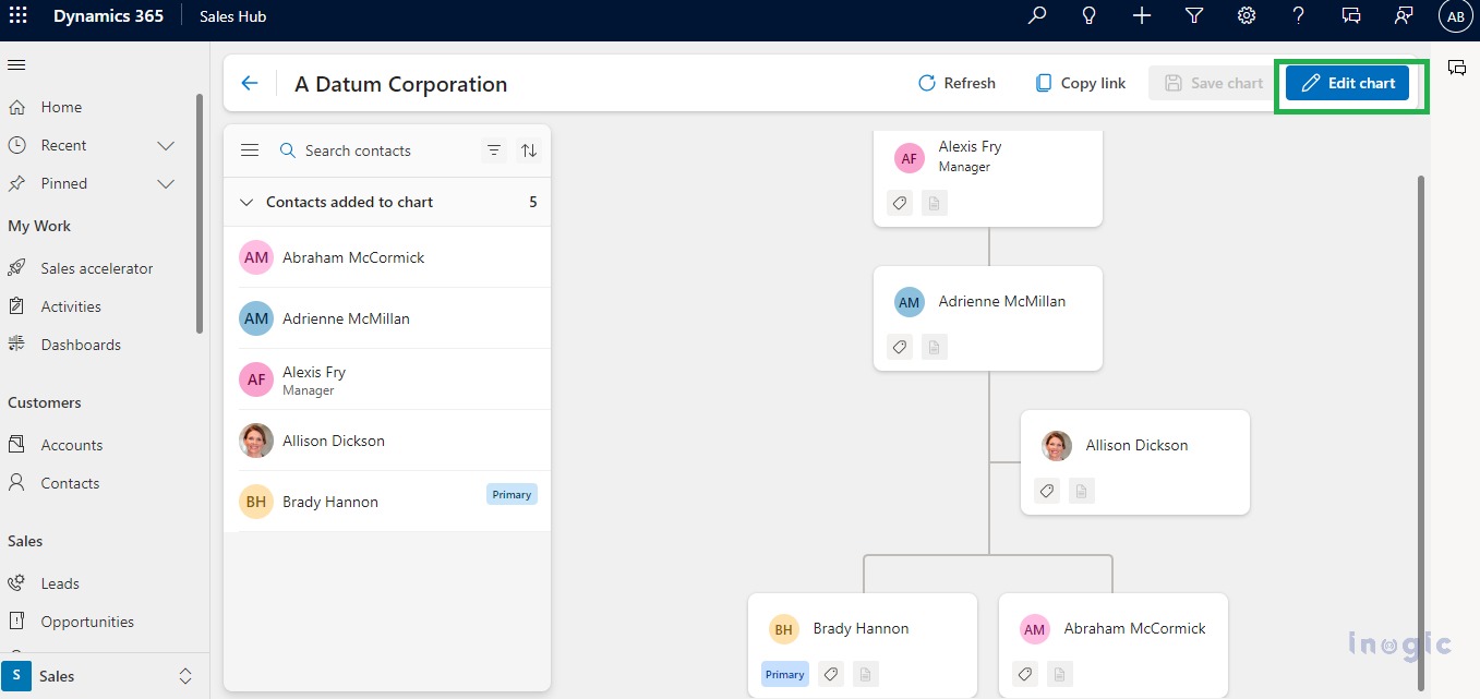
If you are creating a first-time org chart for a particular account then the edit button will not be visible. For the existing organization chart, click on the Edit chart button to make the necessary changes.
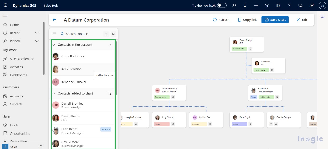
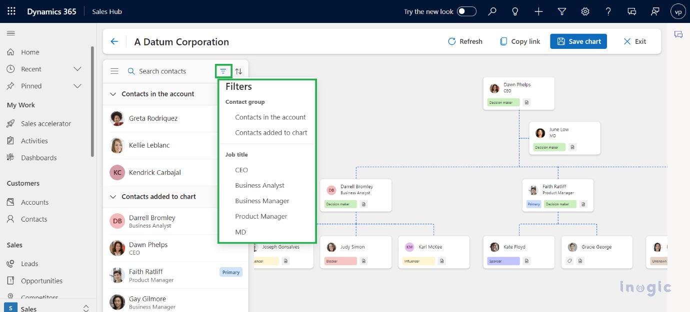
You will be able to see all the associated contacts on the left side pane. You can drag and drop the contacts accordingly from the left side pane. You can also search for the records that you want to drag and drop using the search option present in the left side pane. You can also sort the records listed in the left side pane.
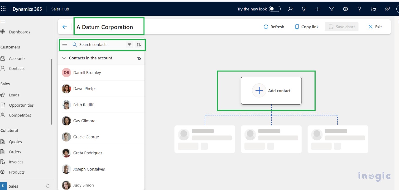
If you want to filter the data according to the Contact group or job title you can use the filter option present in the left side pane.
Various options are included on the contact card once you drag and drop the contact:
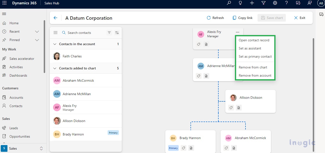
More options
From the contact card, by clicking on the ellipse icon u can open a contact record, set that record as an assistant, and set it as a primary contact, a primary tag will be displayed on the contact card and also on the left side pane. Once you set any contact record as an assistant, it will move to the right-hand side of the chart.
Also, you can remove the added contact card from a chart and also from an account.
Note
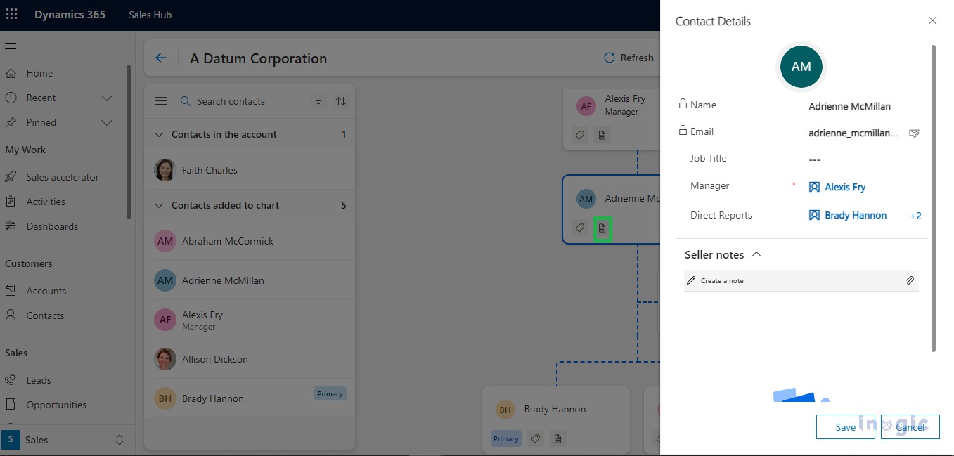
To add a note, Click on the edit chart button then click on the note icon present on the contact card. When click on the note icon, Pane will open on the right-hand side with the following information: Name, Email, Job Title, Manager, Direct Reports, and Seller Notes section. Manager and Direct Reports get directly assigned to respective contacts as we drag the contacts.
Tag
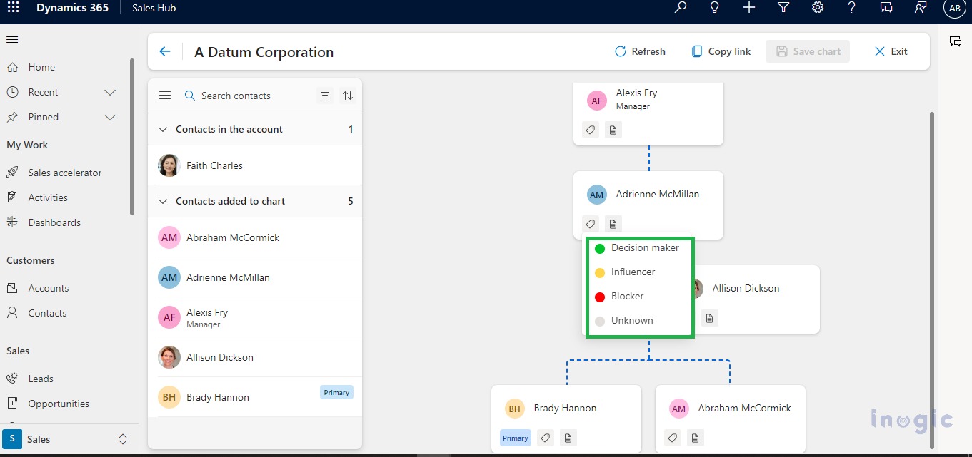
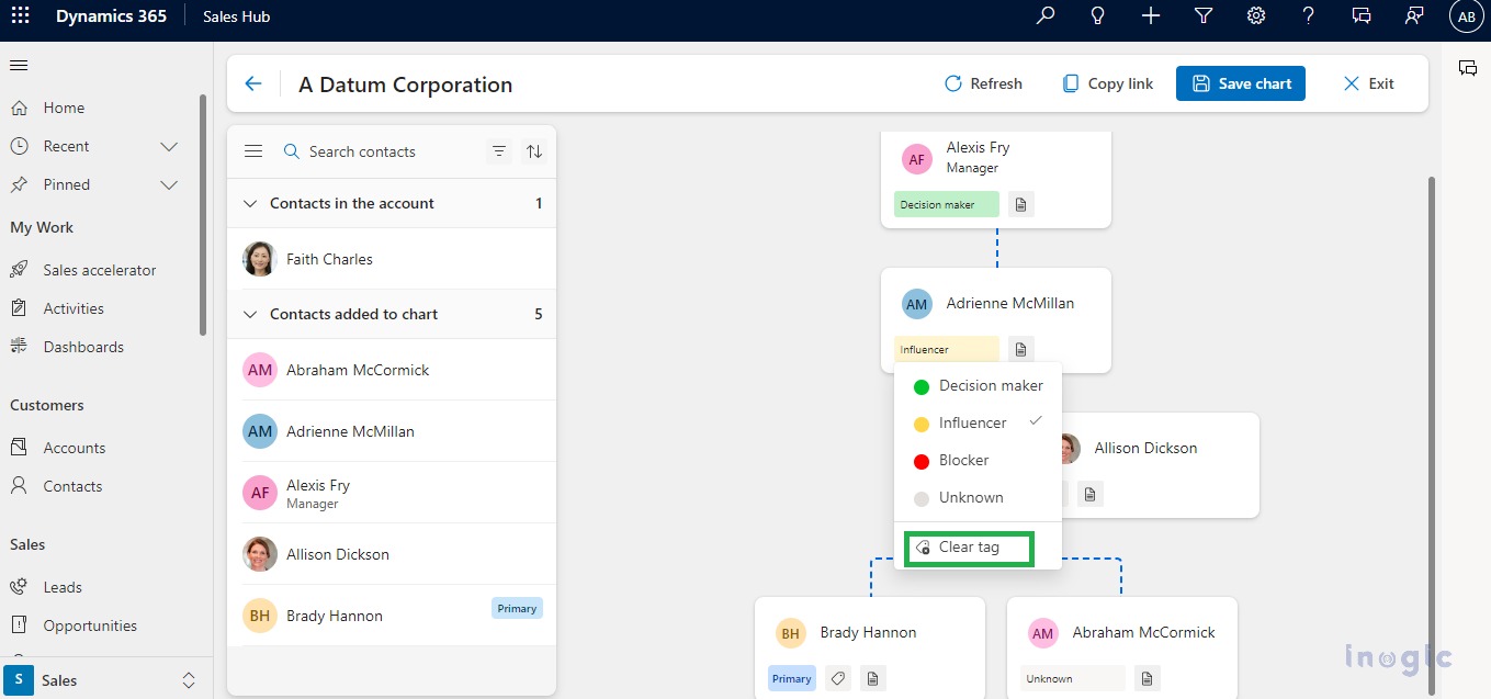
To add a tag to contacts, Click on the edit chart button then click on a tag. The following four tags will be displayed:
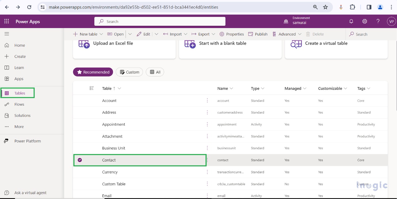
Each tag has its color. You can configure these tags, by renaming the existing tag or adding new tags from the power Apps. To Add or remove tags we must go to Power Apps. Now click on Table and click on Contact Entity
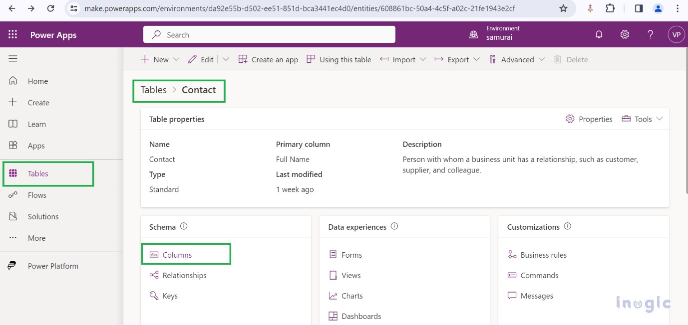
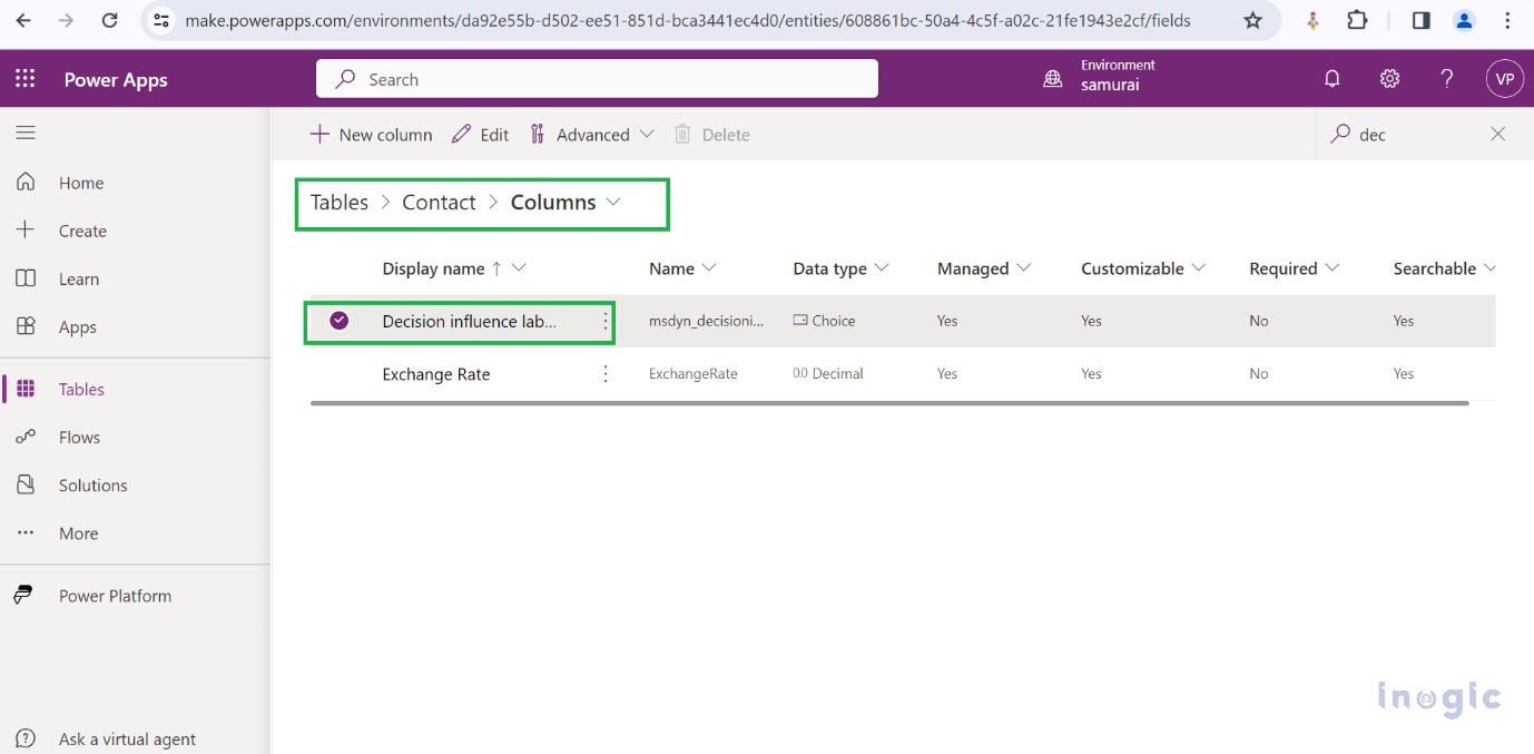
Now click on Columns and a list of columns will open a search for Decision influence labels in the search tab.
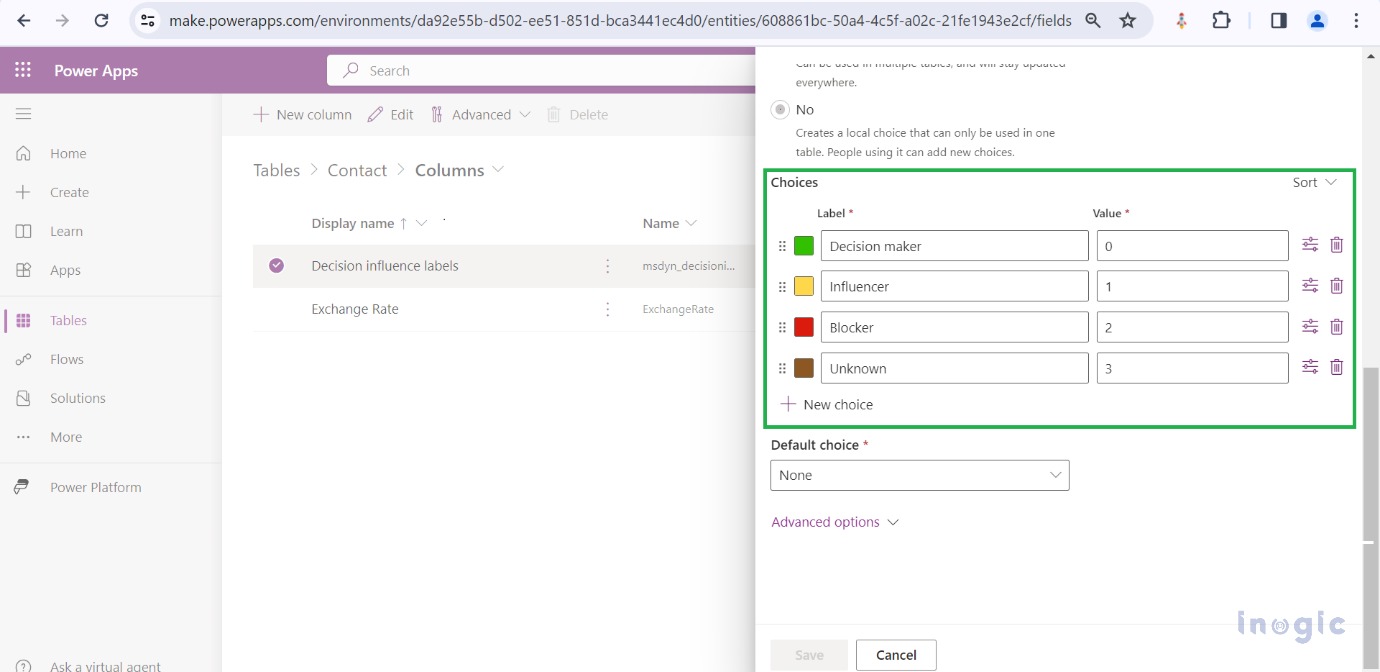
Now click on Decision Influence Labels Edit column panel will open on the right side of the page. Under the Edit column, choices option we will find the Labels. Now you can add the new label using the New Choice option. Also, you can set the color of the choice option.
We can also Edit the name and values for the existing labels and delete the existing labels from the Power apps. You can also clear this tag by clicking on the clear tag button.
Additionally, LinkedIn Sales Navigator can be accessed from Dynamics 365 sales if it is integrated. Also, you can view the health and status of the contact if relationship analytics is enabled.
Note:
The existing org chart will remain as it is but a new UI will be displayed.
When we remove a person from the hierarchy the next person in the table takes his place.
Limitation at the top level, we can’t drag at the top level while editing the chart. We have to first remove it from the chart and then drag the other contact to the top place.
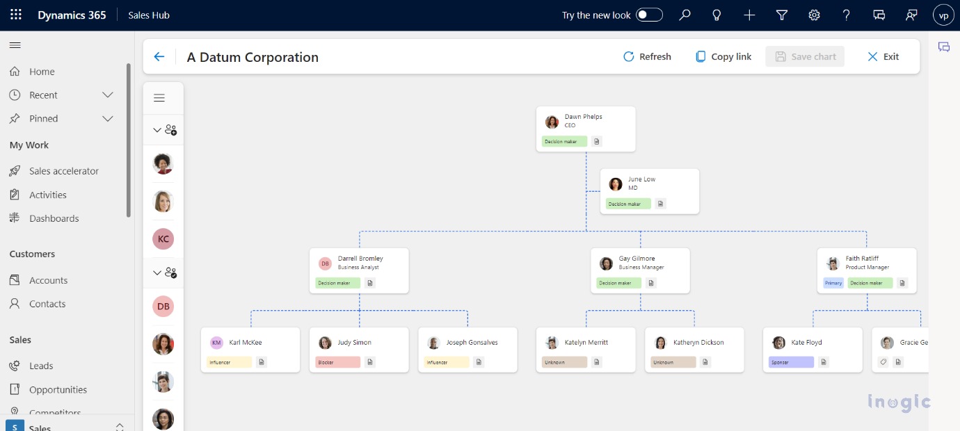
The Final Picture of the organization chart to visualize the stakeholder and their actions.
Conclusion:
The decision-making process can be better understood and key individuals can be identified. The organization chart helps you to connect to the right stakeholders and build partnerships that thrive.
