Microsoft Power Apps gives us the capability to construct a business app with low-code ease based on our business processes. We can design screens in Canvas apps by utilizing various controls provided to automate the process, thereby improving productivity. This enables us to work more efficiently.
Recently, Microsoft has released modern controls and themes that improve the unified interface for forms built with Canvas Apps. This provides users with a more efficient and streamlined experience.
We need to enable the “Modern controls and themes” setting prior to utilizing the controls in Canvas apps within the “Upcoming Features” section.
We can now observe the Modern Controls that can be used to create the required screens in the Canvas app. This will enable us to design the desired interface in a professional manner.
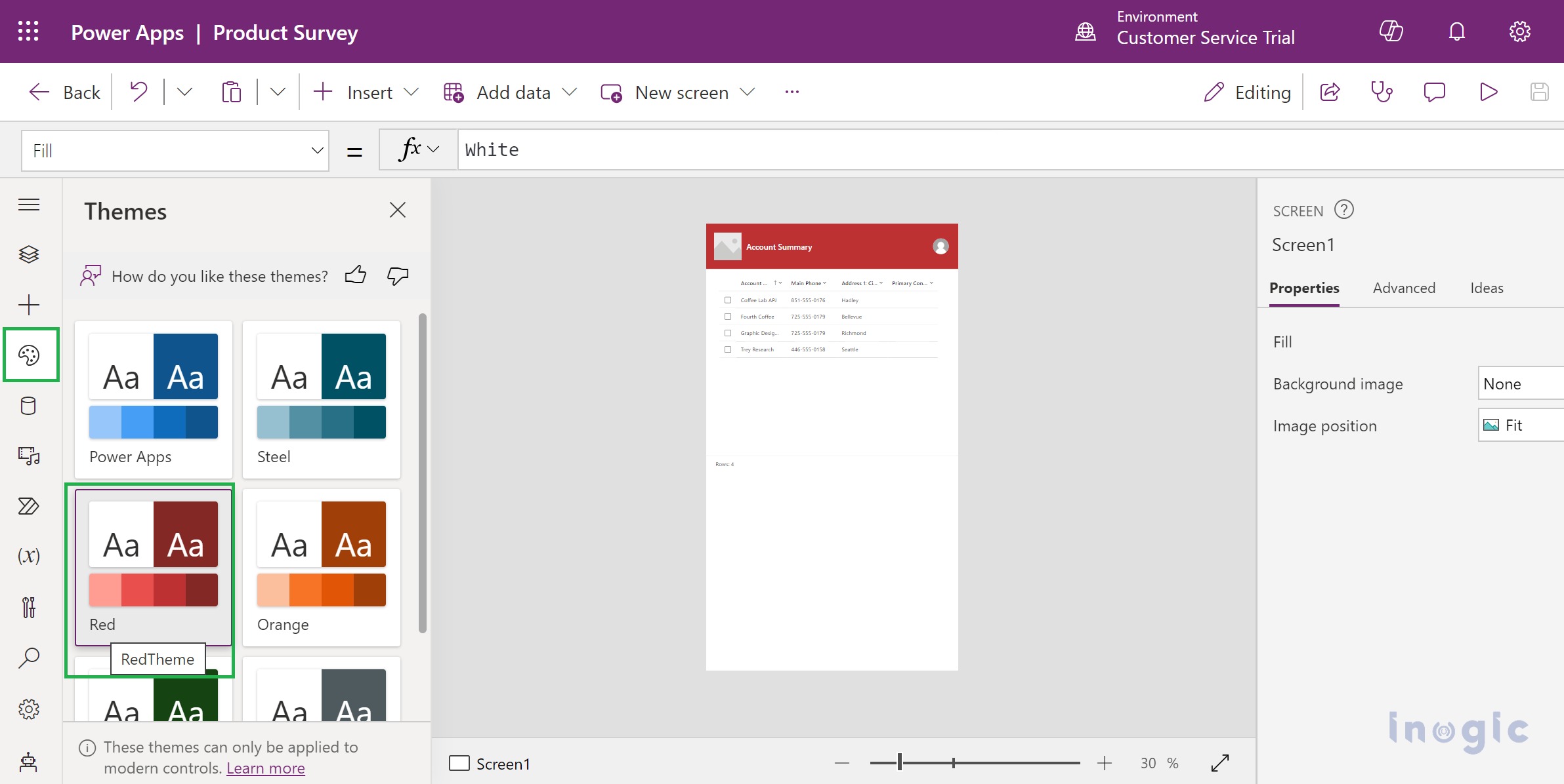
Modern Theme:
As demonstrated in the screenshot, we can use various themes for the Modern Controls. This provides a range of options to customize the look and feel of the controls.
Modern Controls:
In this blog, we will discuss a wide range of modern controls, as listed below, in addition to the classic controls.
Badge, Information Button
Form
Combo Box, Dropdown
Check Box, Radio
Date Picker
Header
Progress Bar
Link
Tab List
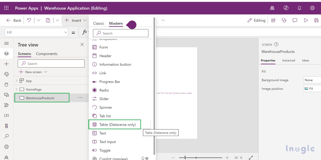
Table (Dataverse Only)
Spinner
Let us consider a use case scenario for a Warehouse Application. This application enables users to add products to the Warehouse and view them to verify them. As we design the app, we will assess the use of Modern Controls, step-by-step. We will now go through the steps necessary to achieve this.
Step 1: Navigate to https://make.powerapps.com and create a new Canvas app “Warehouse Application”.
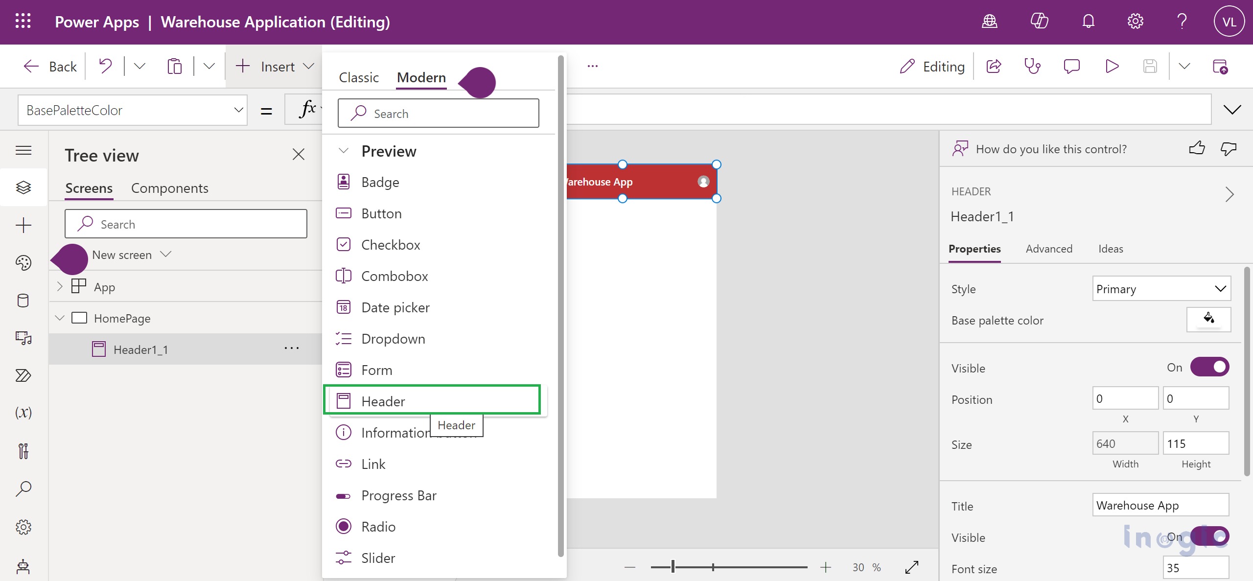
Add a Blank Screen, as we will design the Home Page. Add a Header Control from Modern Controls.
This Header Control has 3 internal components, as below:
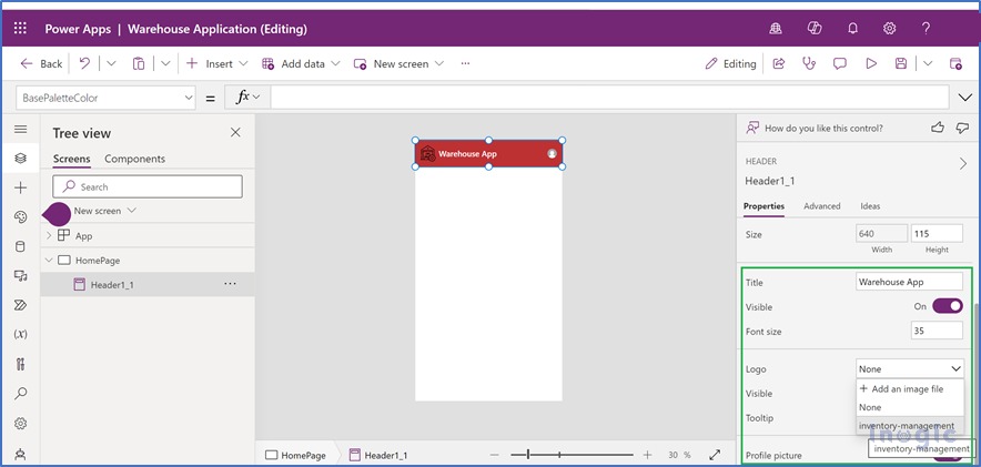
We can customize these components using Properties Pane in the Canvas app. We can add an external image as a logo for the header.
Please refer to the attached screenshot for reference.
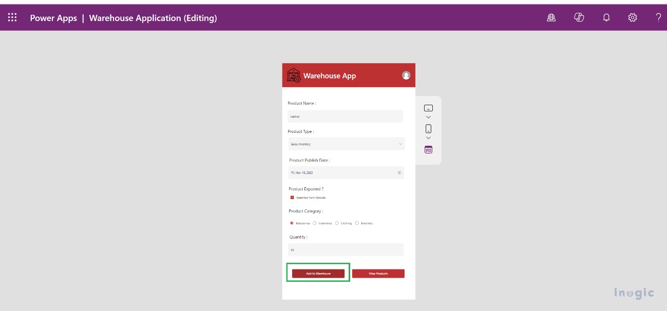
Step 2: We will design a form for capturing product details with controls such as:
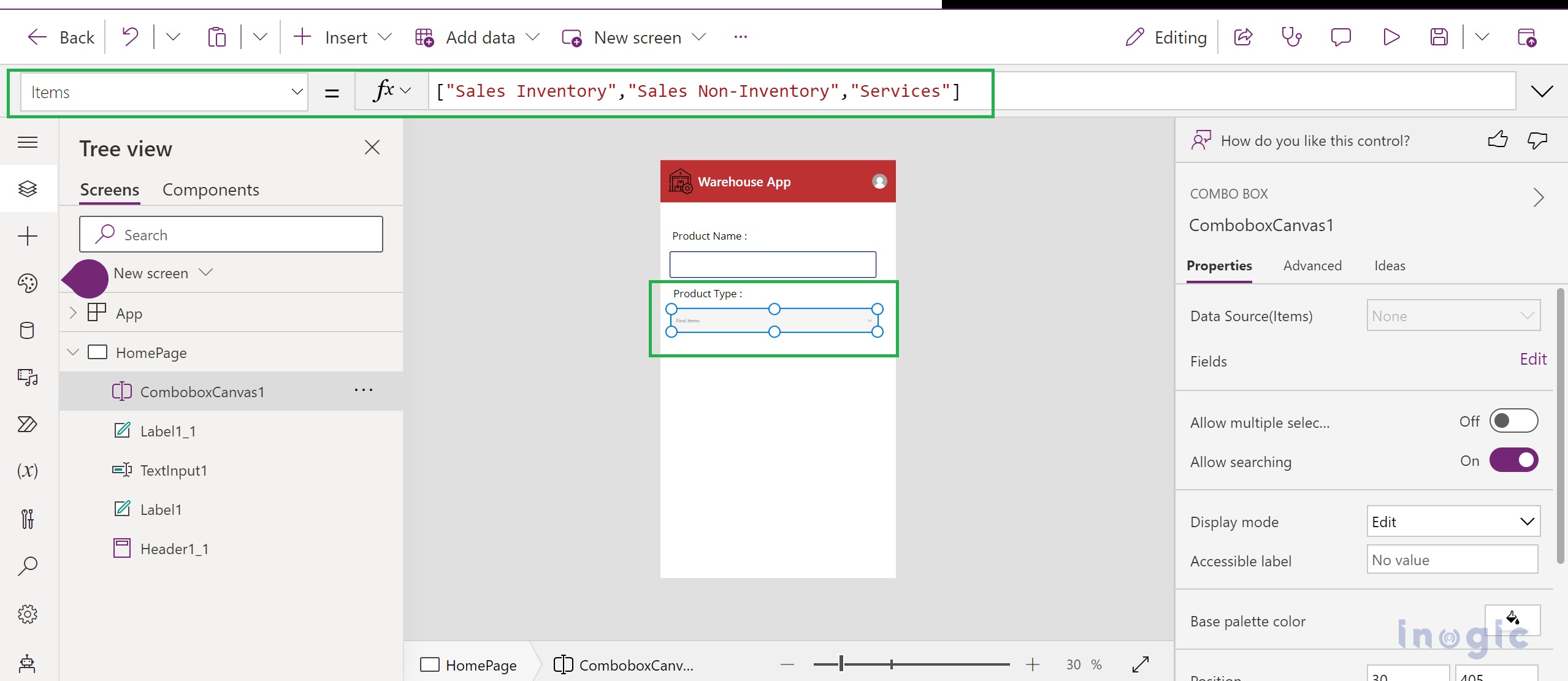
Combo Box – Add a combo box for Product Type, having items as Sales Inventory, Sales Non-Inventory, and Services.
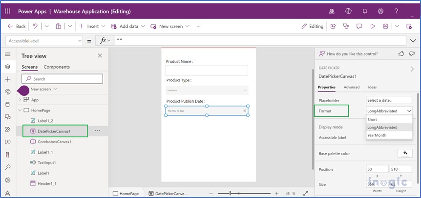
Date Picker – We will use a Modern Control Date Picker that lets us choose one of the following Formats from the Date Picker Properties panel:
Short
LongAbbreviated
YearMonth
Please refer to the attached screenshot for reference.
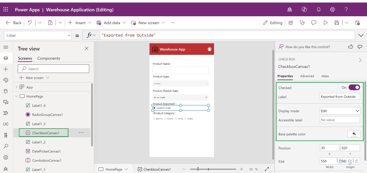
Check Box: Add a check box control and set the Checked property value to Yes from the Checkbox Properties Panel.
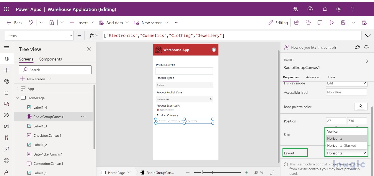
Radio: Add Radio control with Items such as Electronics, Cosmetics, Clothing, and Jewellery. You can arrange the control items in Vertical, Horizontal, or Horizontal Stacked layouts.
Step 3: We have now completed with design form, will add a Button control from Modern Controls, and on clicking this button, we will create Warehouse Products in CRM.
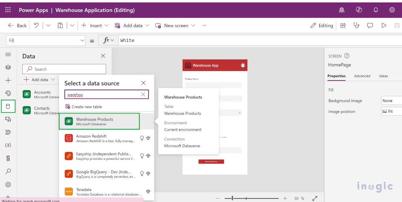
For this, we will first add a DataSource for Warehouse Products entity, as shown below in the screenshot,
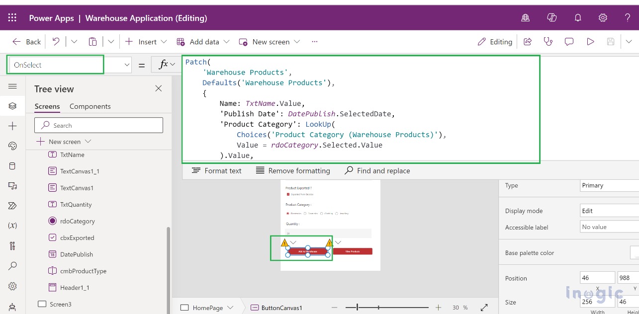
Add the below expression to the “OnSelect” property of the “Add to Warehouse” button, which will create a Warehouse Product record with inputs provided by the User on the form.
Patch(
‘Warehouse Products’,
Defaults(‘Warehouse Products’),
{
Name: TxtName.Value,
‘Publish Date’: DatePublish.SelectedDate,
‘Product Category’: LookUp(
Choices(‘Product Category (Warehouse Products)’),
Value = rdoCategory.Selected.Value
).Value,
Type: LookUp(
Choices(‘Type (Warehouse Products)’),
Value = cmbProductType.Selected.Value
).Value,
Quantity: Value( TxtQuantity.Value)
}
); Notify(“Product Added to the Warehouse”)
Please refer to the attached screenshot for reference.
Step 4: We will add another Button Control, “View Products,” so that the user can verify the products and click, which will navigate to a new screen to display details of all Products from the Warehouse.
So, we will add a new screen, and to display the Warehouse Products will use “Table (Dataverse only)” as shown in the below screenshot,
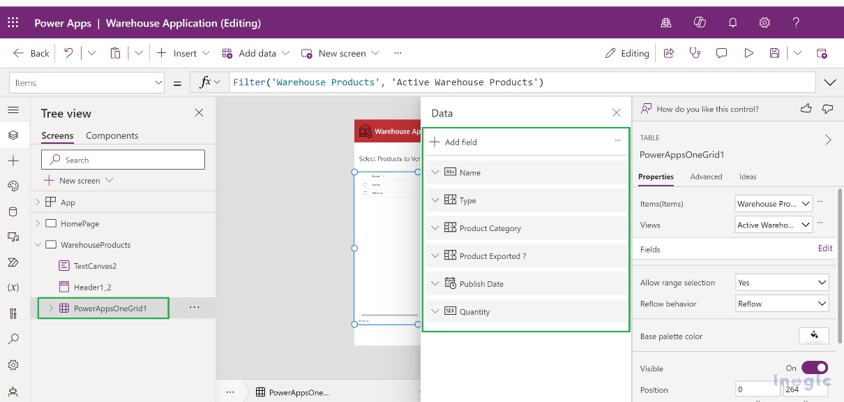
For this PowerAppsOneGrid control, we can choose fields to be displayed as columns in the grid within the Properties Panel.
Please refer to the attached screenshot for reference.
Step 5: Table (Dataverse Only) control provides the ability to select the records from the grid based on the “Reflow Behavior” we select for this control.
Reflow: Allows record selection in the grid. This behavior automatically selects the layout based on screen, either as a Grid (Larger Screen) or a List (smaller screen)
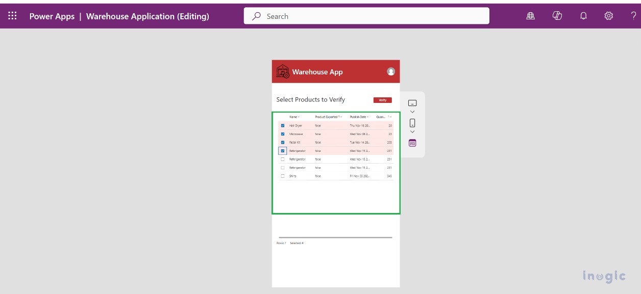
Grid only: Display records in grid layout and allow selection of records as shown in the below screenshot.
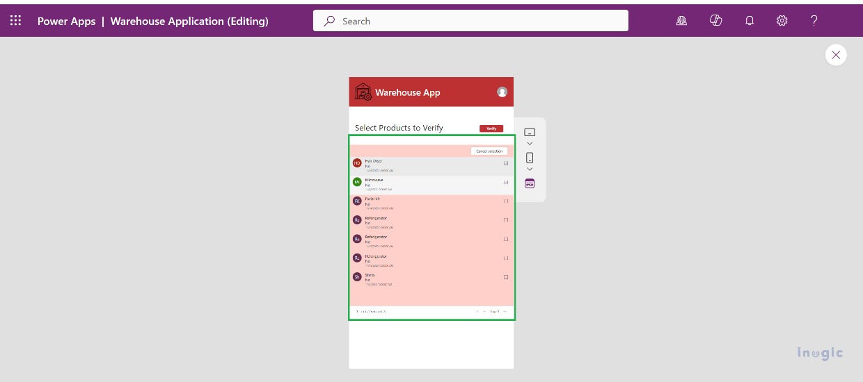
List only: Displays the record in List format with selection capability, as shown in the below screenshot.
So, the user will select the Reflow Behavior for the grid, and the user can select the record from the grid to verify the product. Add a button control “Verify” with the below formula for the OnSelect property.
ForAll(
PowerAppsOneGrid1.SelectedItems,
Patch(
‘Warehouse Products’,
LookUp(
‘Warehouse Products’,
‘Warehouse Product’ = GUID(ThisRecord.’Warehouse Product’)
),
{Verified: ‘Verified (Warehouse Products)’.Yes}
)
);
Notify(“Products Verified Successfully.”)
This will Mark the Products as Verified in Dynamics 365 CRM.
This control has below additional features which make it more efficient.
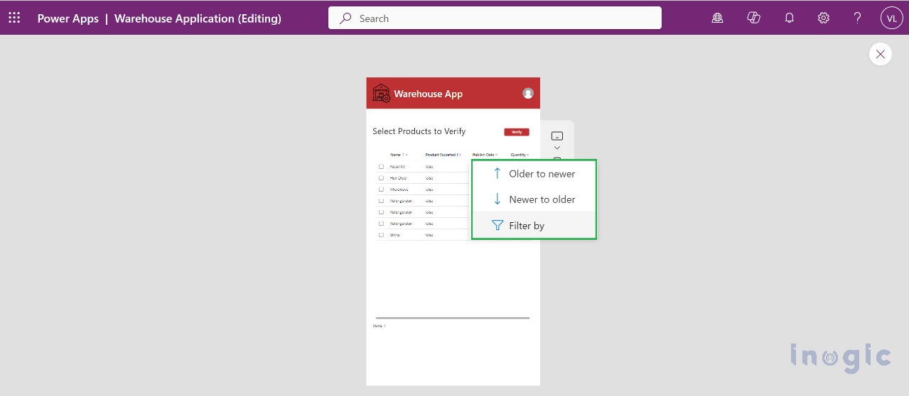
Column Sorting
Column Filtering
Please refer to the attached screenshot for reference.
Conclusion
By adding features within the Canvas App, modern controls and themes have enhanced the classic control. This has led to improved workflows and increased efficiency.
